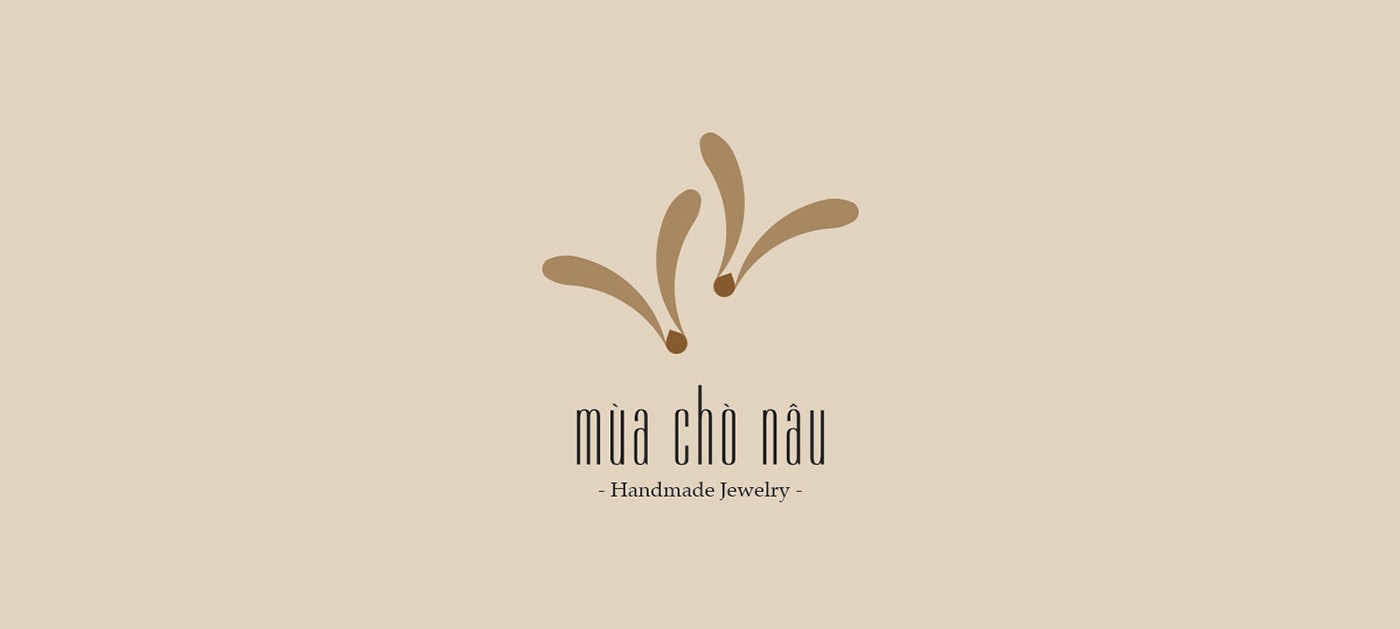

The content of the brief said that they need a rustic, sophisticated, meticulous, impressive and unique brand product.


touchie feelie

Client - Mua Cho Nau

Date - 2019

Service - Logo


Introduce
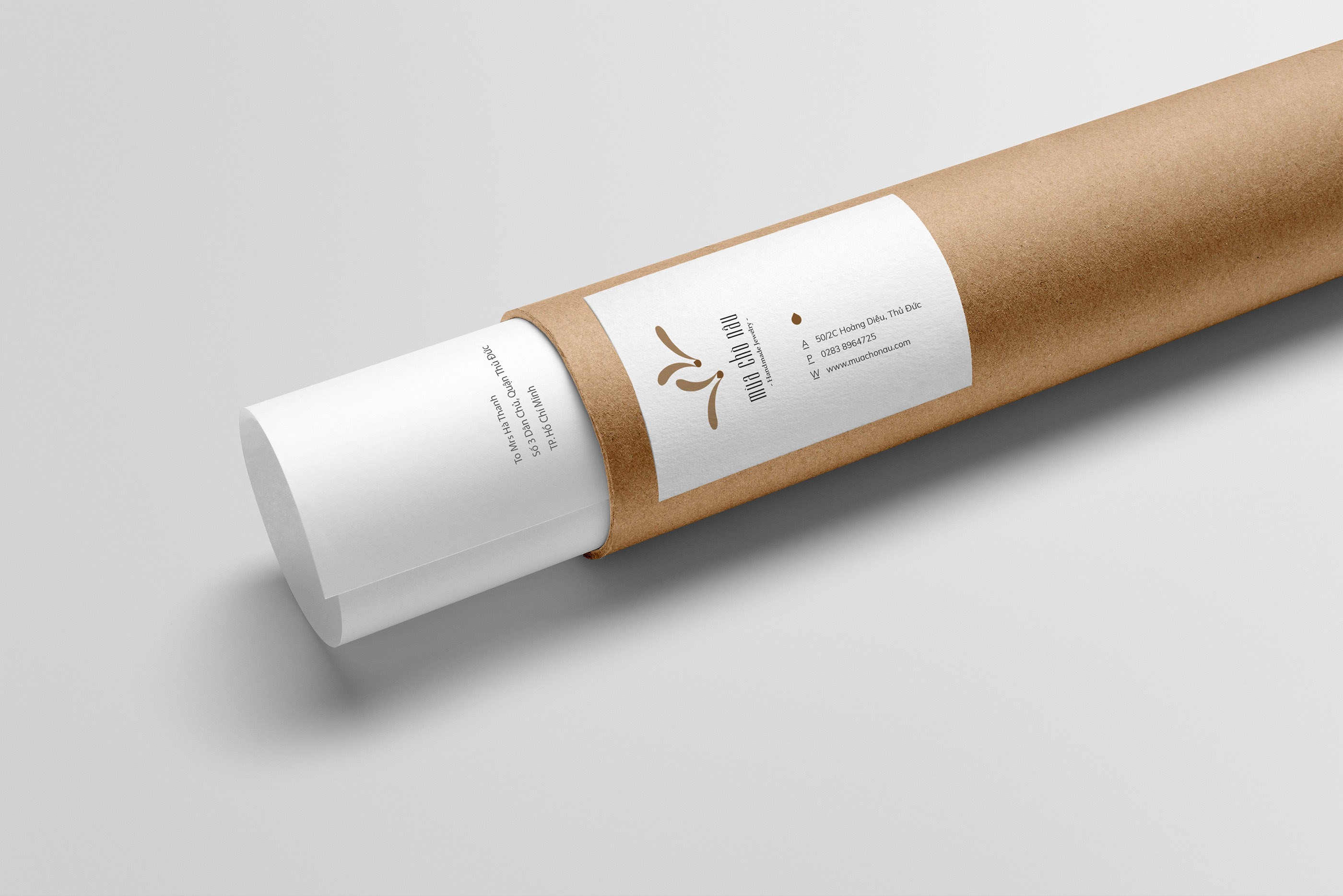
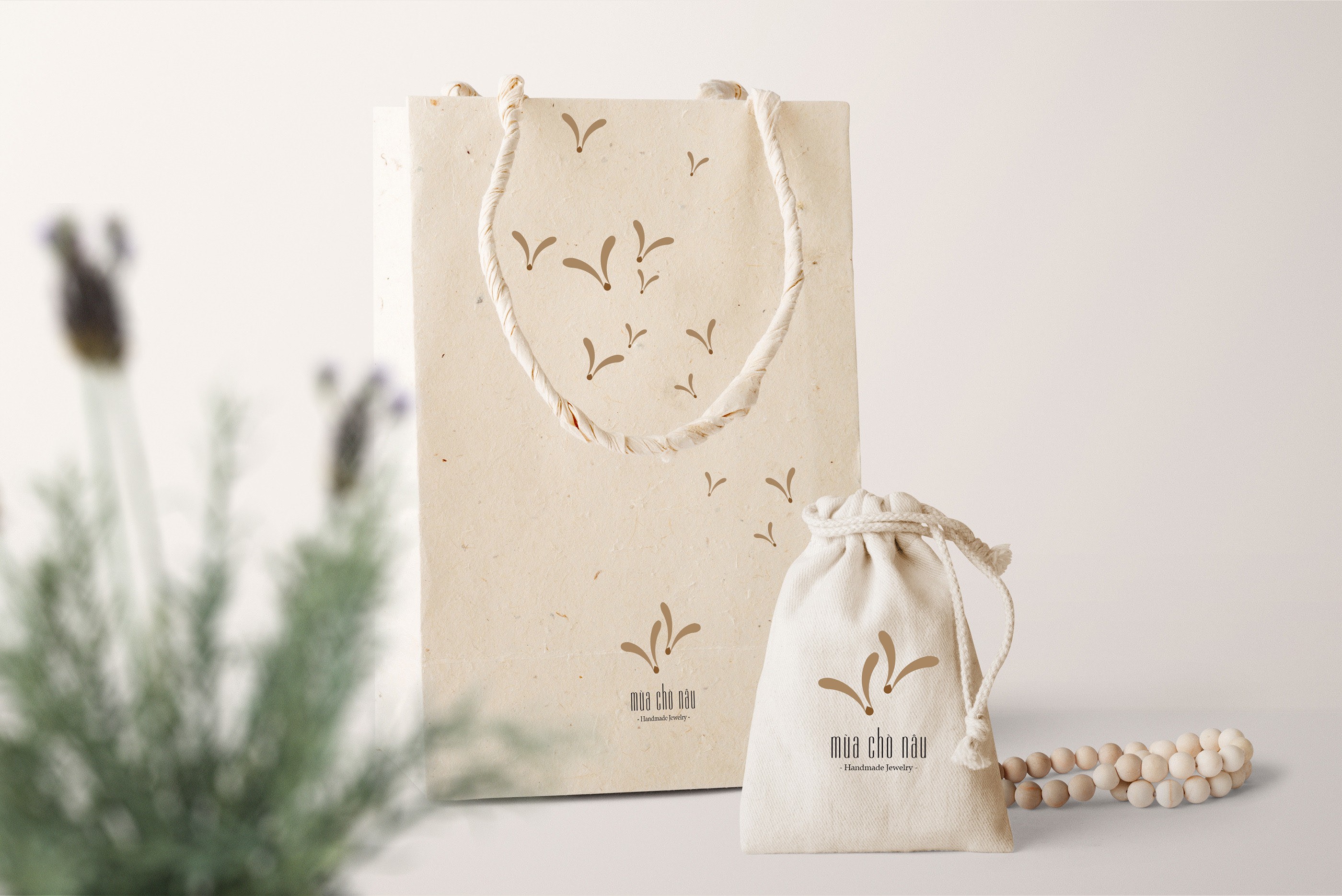
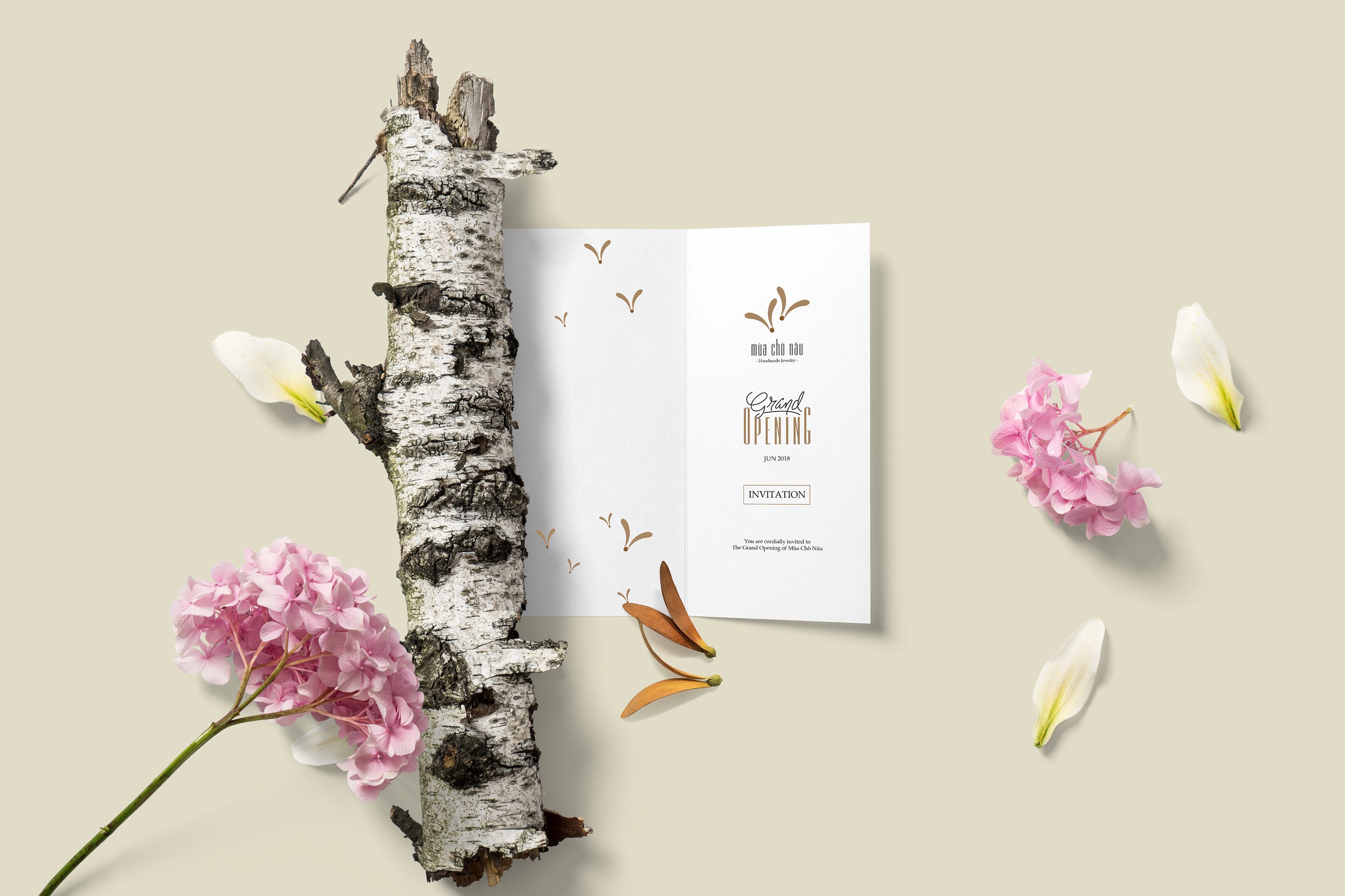
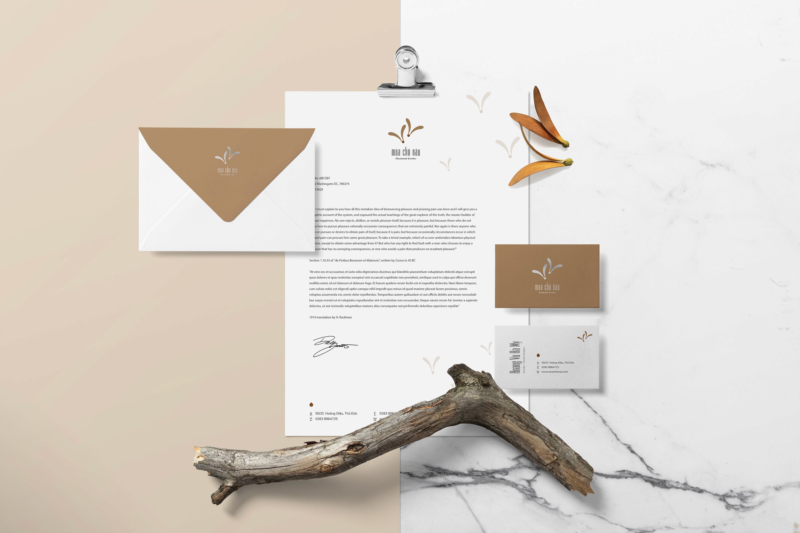
We aimed to create a creative and vibrant logo that reflects the sophistication and uniqueness of "Mua Cho Nau" handmade jewelry products. The logo will be a symbol of creativity, quality and personalization, helping to stand out in the eyes of customers and build trust in the brand.
We aimed to create a creative and vibrant logo that reflects the sophistication and uniqueness of "Mua Cho Nau" handmade jewelry products. The logo will be a symbol of creativity, quality and personalization, helping to stand out in the eyes of customers and build trust in the brand.
"Touchie Feelie" is a cute, petulant way of saying
for children. Children always need to be comforted,
cared for, and also want to be understood.
Touchie Feelie is made up of friends who share
the same love for children and those who directly
care for their children.
Tools We Used


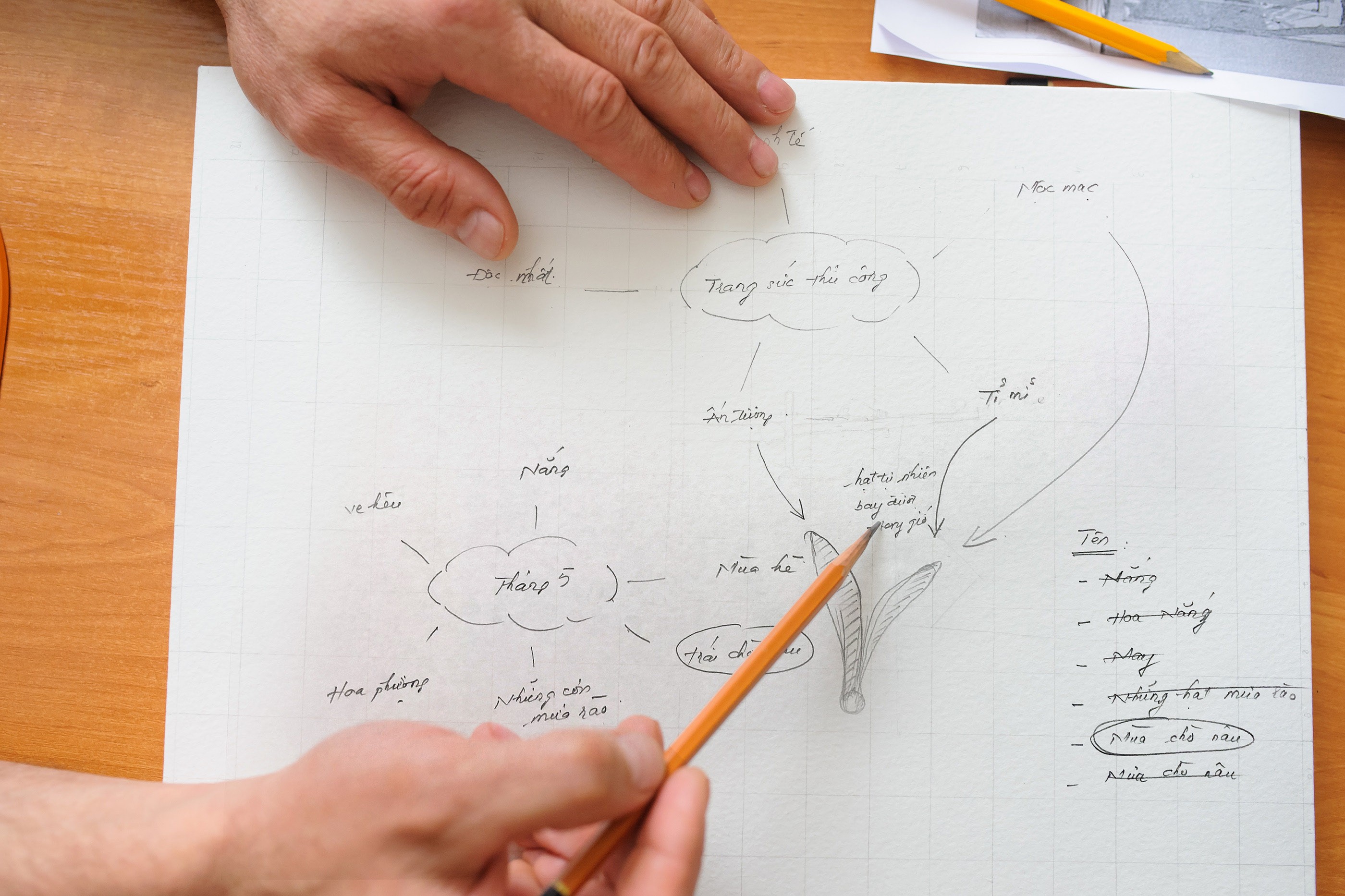
The content of the brief said that they need a rustic, sophisticated, meticulous, impressive and unique brand product.

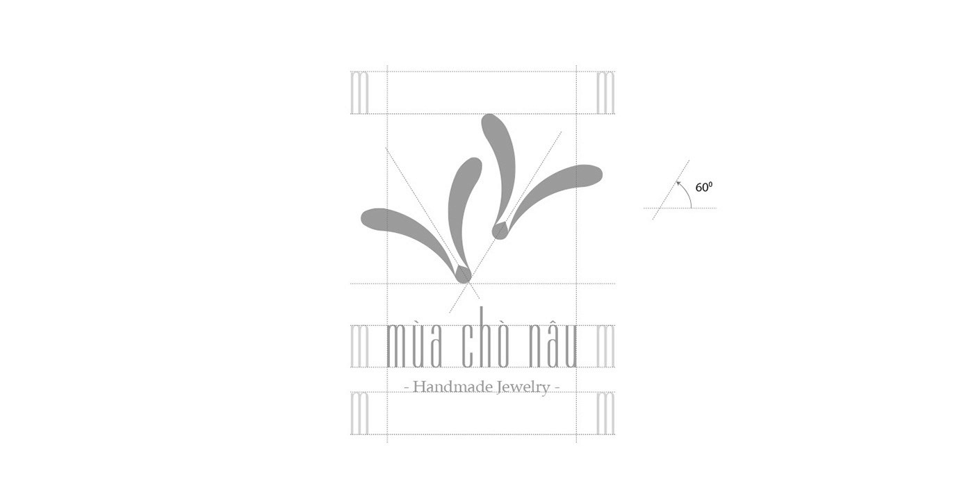
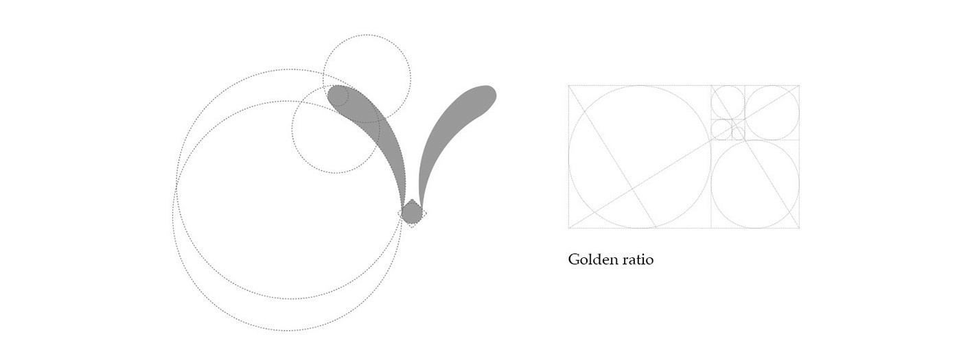
So I started with the golden ratio to make suremy design relate to their products.
So I started with the golden ratio to make sure my design relate to their products.
Using Golden Yellow toner.


The content of the brief said that they need a rustic, sophisticated,
meticulous, impressive and unique brand product.

So I started with the golden ratio to make suremy design relate to their products.
So I started with the golden ratio to make sure my design relate to their products.
Using Golden Yellow toner.


© 2024 All rights reserved by Tien Le
Designed by @tienle
© 2024 All rights reserved by Tien Le
© 2024 All rights reserved by Tien Le